
Unlocking Operational Excellence: The Power of Subtle Design in eOCS

Have you ever wondered why eurofunk‘s revolutionary operations control system, eOCS, embraces a more muted color palette compared to its competitors? .
WHY THE MINIMALIST COLOR SCHEME?
eurofunk aims to create a system that helps users work comfortably and without fatigue. We want to help them perform their tasks effectively, even during long shifts that span day and night.
HOW DOES EUROFUNK ACHIEVE THIS?
In eOCS, we adhere to a fundamental eurofunk principle: uncompromising simplification. This philosophy is clearly evident in our limited utilization of color, which is guided by the users’ need to focus on the essentials. By opting for neutral shades for large areas, eOCS intentionally reduces visual distractions. The outcome? Improved alertness to changes or errors, thus minimizing the risk of overlooking critical information.
ERGONOMICS IS THE KEY
Looking at it from an ergonomic perspective, opting for grey backgrounds is a smart choice. Grey, positioned between the sharp contrasts of white and black, alleviates eye fatigue and discomfort. To diminish eye strain and enhance clarity, we recommend the use of no more than six colors at a time. In the eOCS system, colors are employed in a deliberate and selective manner. This strategic approach prevents sensory overload and reduces the possibility of missing vital information.
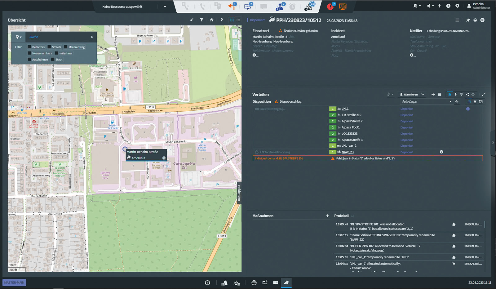
eurofunk incorporates these ergonomic principles by offering a Dark Mode feature, ensuring a pleasant user experience in low-light settings.
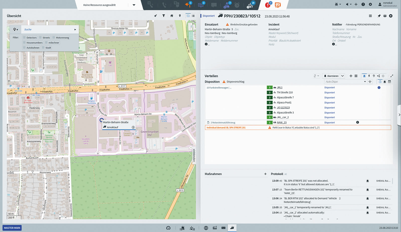
Incident handling in day or night mode
FOCUS ON SIGNALING
Nevertheless, colors are crucial for indicating important events and changes in eOCS. We follow DIN EN ISO 9241 recommendations to use signal colors to draw users‘ attention to notifications, error messages, and success indicators.
An excessively vibrant interface can distract from more important color-coded elements, making it harder to quickly spot new or modified information. Therefore, eOCS uses colors judiciously, maintaining simplicity and reducing unnecessary distractions.
Intermittent color highlights for active elements and mouseovers help users navigate without visual overload.
Which gives us another answer to our original question about the minimalist color scheme: less is more. This makes sure that the system gives you the right information at the right time because – as we all know – every second counts.
THE OPINION OF USERS /strong>
Our usability tests strongly endorse eurofunk‘s approach. When put through usability and concept tests in real-world control center scenarios, users consistently praise our design for its clarity, organization, and aesthetic appeal. This overwhelming vote of confidence motivates eurofunk to remain dedicated to its minimalist design philosophy and to continuously enhance the user experience.