



Why eOCS focuses on visual calm
Fewer visual distractions for greater focus during incident management

Control center workstations are among the most demanding computer workstations of all. Dispatchers work in shifts under intense pressure and must simultaneously process a vast amount of information – from emergency calls and status updates to radio communications and the latest developments in ongoing incidents.
This is precisely why eurofunk has opted for a deliberately minimalist and ergonomic user interface in eOCS. An incident command system must present information in such a way that important details can be immediately recognised, without placing additional strain on users through unnecessary visual distractions.
Why does eOCS appear less colourful than other systems?
eurofunk is regularly asked this question.
The answer is simple: in the control center, nothing must distract from mission-critical information. If a large number of colours, strong contrasts or extensive highlighting are used continuously, it creates visual clutter. This makes it harder to quickly identify new incidents, priority changes or critical messages.
That is why eOCS consistently follows the principle:
“As little as possible, but as much as necessary.”
Colours are used where they are actually intended to attract attention – for example, in the case of:
- open alerts
- status changes
- priority changes
- warning messages
- error conditions
- safety-related information
Focus on the situation rather than the interface
When handling operations, users often have to work with concentration for many hours – both during the day and at night.
The aim of eOCS is therefore to provide an interface that remains clear and pleasant to use even during long shifts.
Large neutral areas and minimal colour accents help to:
- avoid visual overload
- recognise changes more quickly
- improve orientation within the situation
- direct attention in a targeted manner
Particularly in dynamic operational situations, a minimalist interface helps users to grasp information quickly and avoid misperceptions.
Ergonomics plays a central role in control centers
Control centers are characterised by a high density of information, time pressure and parallel workflows. That is why eOCS is based on ergonomic recommendations for safety-critical systems – including DIN EN ISO 9241.
The deliberate use of colour helps to:
- reduce eye strain
- minimise signs of fatigue
- highlight important information
- maintain concentration even during night shifts
Visual calm reduces cognitive load
In control centers, users must process and prioritize large amounts of information in a very short time. Unnecessary visual stimuli increase what is known as cognitive load and make it difficult to quickly identify relevant events. That is why eOCS deliberately uses a minimalist visual design with low visual density. The goal is to direct attention specifically toward mission-critical information and minimize the risk of overlooking important alerts or status changes.
The choice of background colors is also based on ergonomic considerations. Shades of gray reduce glare and support less tiring work—especially in control center environments with changing lighting conditions or during night shifts. Very bright surfaces can place additional strain on the eyes due to strong contrasts and increased light reflection. Very dark surfaces, on the other hand, can impair the readability of light-colored elements and lead to so-called halo effects—visible halos of light around bright content.
For this reason, eOCS relies on carefully coordinated shades of gray that create a good balance between contrast, readability, and visual calm. Colored backgrounds are also deliberately avoided. In eOCS, colors are reserved for alarms, warnings, and prioritized events. This makes critical information stand out more clearly and allows it to be perceived more quickly, especially in dynamic operational situations. The calmer the background design, the more clearly relevant signals stand out.
Dark Mode for 24/7 control center operations
Screen display plays a particularly important role during night shifts. eOCS’s Dark Mode reduces glare in dark control center environments and makes working more comfortable during prolonged screen use. This ensures the interface remains easy to read even at night and supports focused work over extended periods.
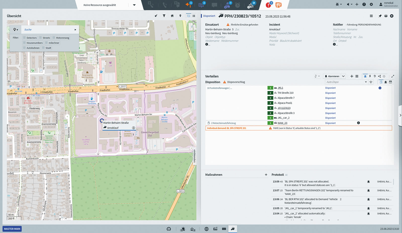
Incident handling in day or night mode
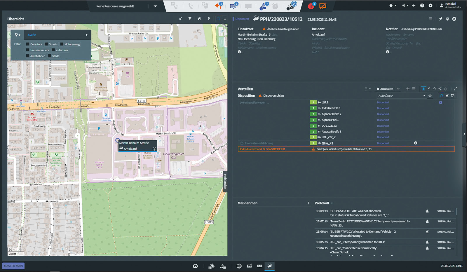
Feedback from control centers confirms the approach
Feedback from usability and concept tests conducted with control centers confirms that we are on the right track.
Users frequently describe the eOCS interface as:
- clearly structured
- uncluttered
- easy on the eyes
- easy to navigate even during prolonged use
Especially in shift operations, it becomes clear how important a calm and clear display is in daily mission management. The positive feedback encourages eurofunk to consistently further develop its ergonomic and color-reduced approach.